Research after the second mindmap: focusing on educational/instructional content, trans work, and clothes repair/customisation content
Nb: tried to make work about making the emotional/mental state of the the trans community more sustainable, but I feel like I came to the end of the branch I was trying, and idk if I have the time and emotional energy to push that particular side of things for this project. So I’m trying to find a new area by thinking about the other area I identified (anti fast fashion, pro textile literacy) and about what I like to draw (eg instructional drawings with steps and details that convey physical info).

http://lindastupart.net/gallery-education.php
.
Disobedient Objects (V&A); How-To Guides, illustrations by Marwan Kaabour


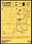

Instructional, with clear steps. Text and image together provide the explanation – neither alone would be enough; although it’s the image that quickly presents the topic and seizes the audience’s attention. Quite complex processes, not providing all information, and assuming a certain level of understanding on the part of the audience in order to be able to quickly cover the whole processes.
Not so much 100% practical instructions, also interested in conveying the idea and possible functions of an object?
http://www.vam.ac.uk/content/exhibitions/disobedient-objects/how-to-guides/
.
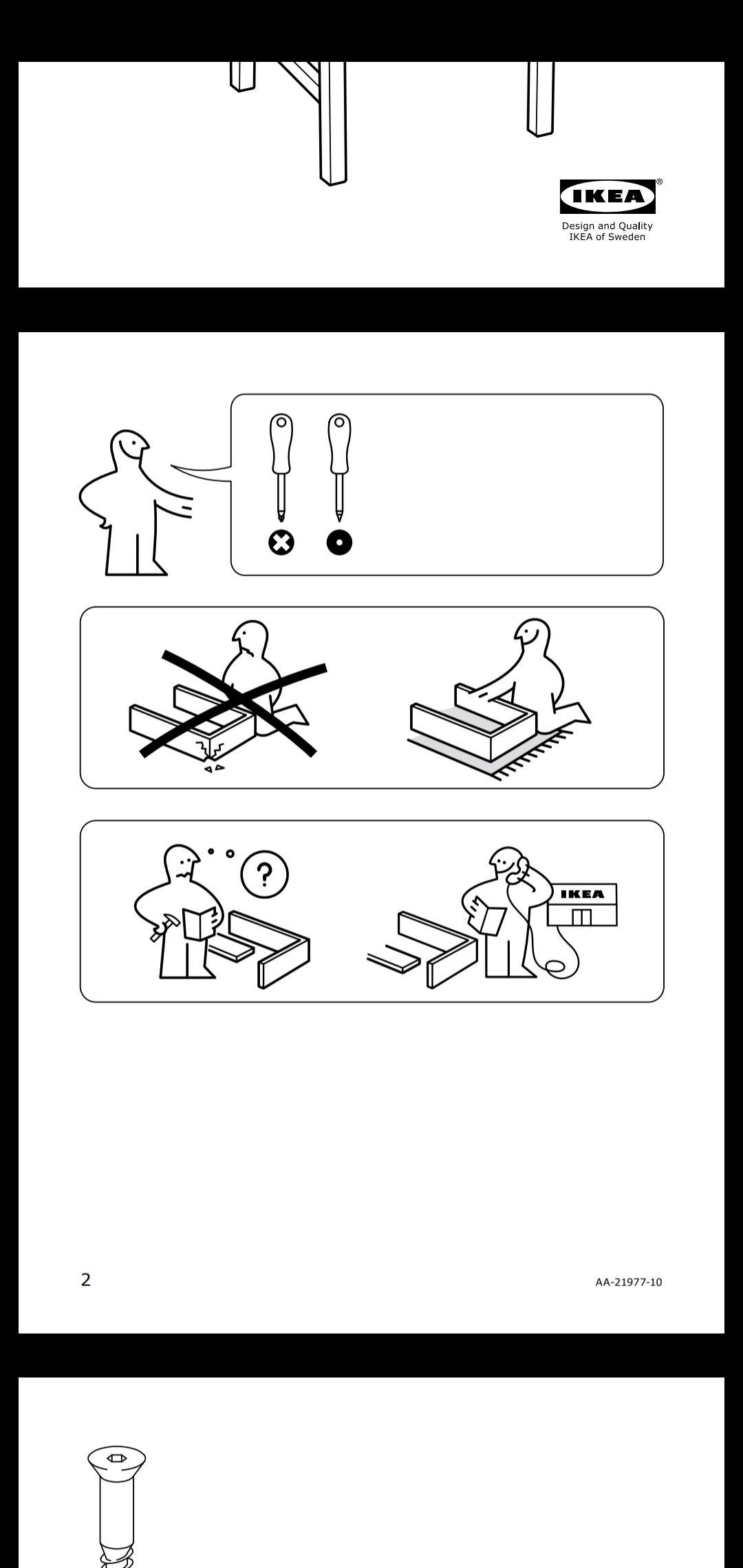
IKEA assembly instructions: sample from the Stefan chair


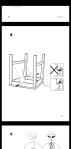
- Absolutely no text (except numbers): the instructions aren’t bounded by language gaps. An exercise in direction without verbal language
- Simple images convey ideas in such a way that you can ‘read’ them. Eg, the second page clearly reads ‘You’ll need these two types of screwdriver. Complete the assembly on carpet, as a hard floor could damage your product. If the instructions are unclear, please give us a call.’ Even mood is conveyed, using the body language of the simple figure.
- Images are given a lot of space so even complicated steps are broken down and spaced out and can be clearly understood. The spacing encourages taking the time to understand?
- Images of people are simplified and for a specific purpose (to convey mood, or show you how to hold a tool)
- Images of the product and tools are technical drawings: detailed enough to show all relevant details, but simple enough as to show only the relevant details and therefore be as clear as possible
.
Lots of online sources on sewing and clothes repair are on private blogs, where the focus isn’t necessarily on the best educational/instructional ways to frame and convey the information, isn’t on the ways that people best learn and understand.
Eg:

Instructions/explanations often come packaged just as a sample image and a block of text.


Even if the text is broken into steps, there’s still rarely individual images to help the reader visualise and understand each step. Nevermind to even help them read the text without losing focus/interest and confidence. (https://www.thesprucecrafts.com/learn-stitches-and-hand-sewing-projects-2978472)
How to keep your reader confident and interested?
Do videos do that, or do they just let them be passive and keep watching without really focusing?
Another common layout for textiles information is one image which contains all the info at once, eg

This is sort of better, but it can still be hard to understand because the reader has to do the work of visualising each step separately in order to understand. The one-image version does have the advantage of taking up less space than 3-4 images of the separate steps (and therefore being less intimidating?). Cf above the contrast between the How-To Guides, which seek to convey a lot of information very concisely, and the IKEA assembly guides, which seek to convey a lot of information in a format which is as accessible and approachable as possible. Concise information presentation vs clear and thorough information presentation.
Does efficient/effective mean prioritising quick or clear, if those things become rival options ?
.

Using photos, presenting the information in images of reality, can help the reader because it allows them to check irl if their reality matches up with what they’re aiming for. But if it doesn’t match up, or they don’t understand how to get to that step, a photo struggles to help them understand why/how: it contains a lot of irrelevant distracting information, and can’t contain all the relevant information (because of things like opaque fabric and lines of sight, which don’t have to be applied strictly to illustrations).
.
Wikihow: quality varies, as some articles use photos, others illustrations, and the ratio of reliance on text vs image varies. But some are clear and effective:


- The images are clear and simple, with an effective use of colour (could they be improved by using colour to highlight the active part of the thread, like some sewing manuals?).
- The text provides clarification and further info, but the steps are broken down into separate images, and the images can convey and visualise the whole process themselves.
.
Examples from The Embroidery Stitch Bible by Betty Barnden:


One plus is that these use photos and illustrations – to try to make the steps clear but also allow you to see how the reality comes out.
If you sort of know how to do these stitches and you need a bit of guidance, or you just need a reminder, or you have practice reading these kinds of images, then these instructions work.
But if not, eg if you are a full beginner or a beginner to French knots specifically, these instructions are definitely hard to follow:
- Not only are the images not spaced out, they also each depict multiple steps, which makes them complex and hard to read
- The text is in effect just a block of words, despite a slight attempt to use indexes to separate steps.
- The information that breaks up the text and links steps in the text to steps in the image is just more words, so it isn’t clear to visual readers/learners, and it takes a minute to fit the image+text together. This places another hurdle in understanding. (like I said above, if you’re used to reading these kinds of images and texts, eg knitting patterns, then it’s fine, but otherwise it’s not accessible. It’s kind of a specific language/dialect that beginners need a lot of practice to get used to)
Also, even if these explanations are clear, they’re often inaccessible because they’re found in books (which cost money and are a commitment) full of stitches and patterns. That kind of format is likely intimidating to lots of beginners.
.
Life hack videos
Instructional YouTube chanmelz
