Plain inkbox line work:
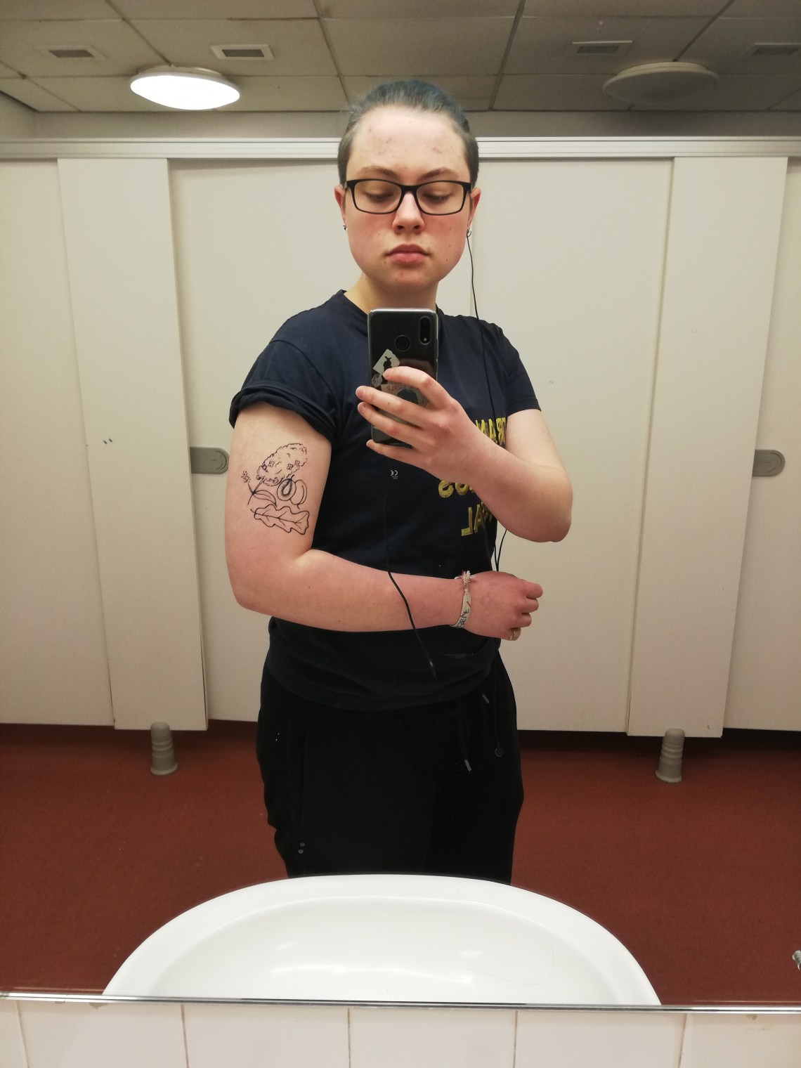
.
Inkbox line work + watercolour
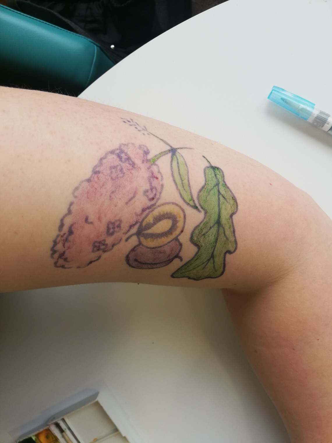
The colour is delicate, which is kind of appealing for individual Tattoos. But I think for a large area with lots of different plants, brighter and more distinctive colours is more effective, because it contrasts and identities the plants more clearly.
Also, the watercolour is harder to apply to skin than I expected. You have to rub it in to the skin slightly in order to avoid it drying on the skin in droplets, and that reduces the pigmentation.
.
Inkbox line work + watercolour fill + watercolour background
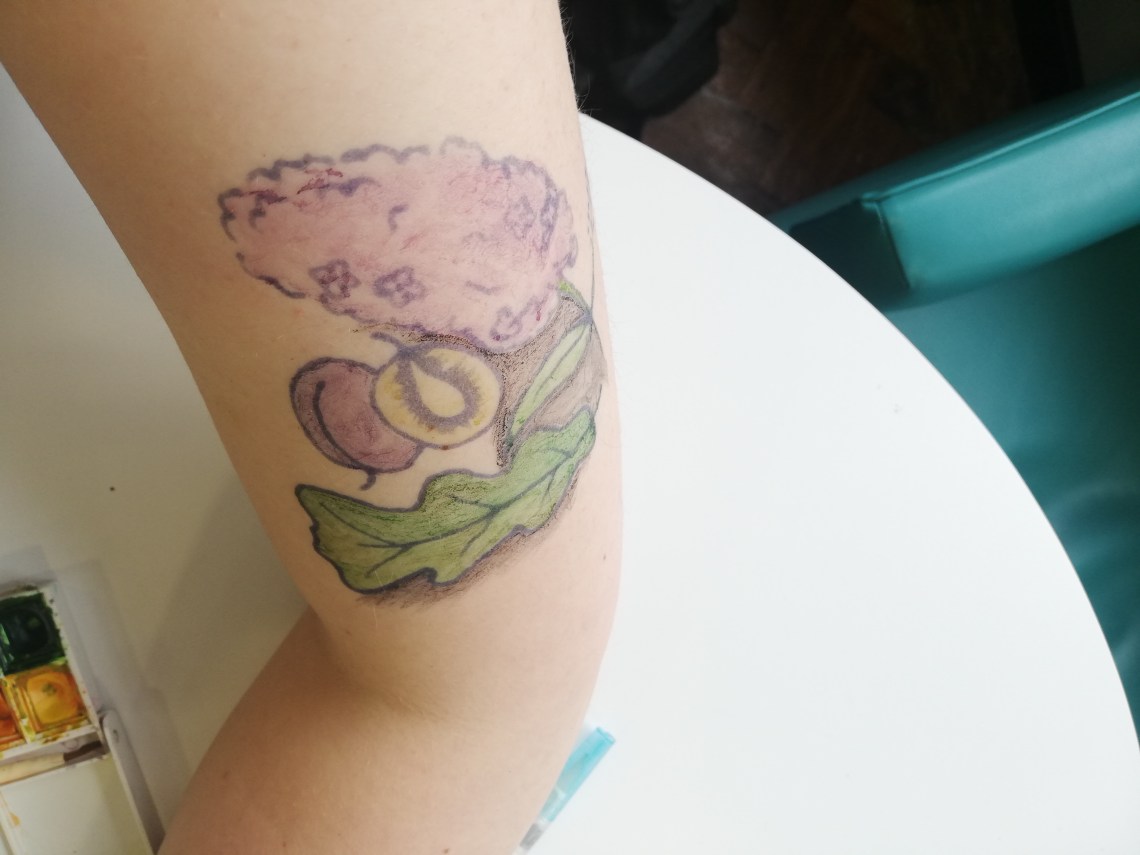
The background in dark watercolour isn’t effective. It’s not possible to make it strongly pigmented, so it doesn’t provide contrast/make the plants jump out, it just looks dirty.
.
Inkbox line work + colour in permanent marker (sharpies)
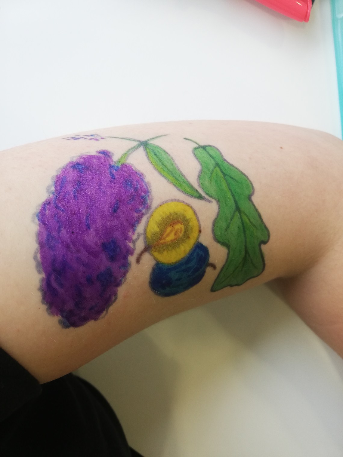
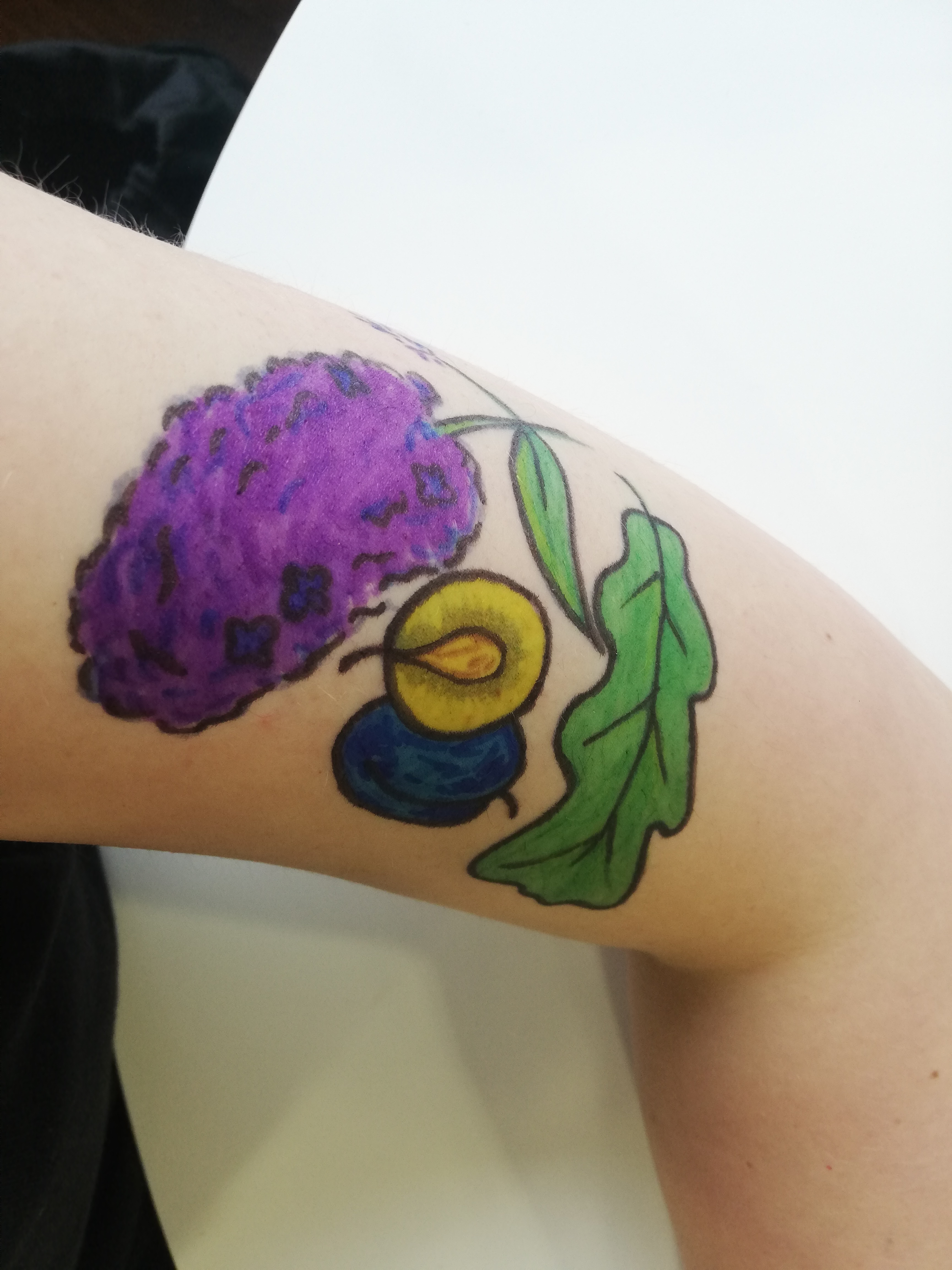
Colour is so much more vivid (and easier to apply), and bright in a way I think I like. But it does unfortunately erase the internal details of the lineart (like the buddleia flowers and squiggles), and make the outline seem weak. So…
Colour + line work both in permanent marker

Very bold and distinctive. So vivid that the plants leap out without there needing to be a dark background, which means the external details of the lineart can be preserved, which is ideal.
Need to check with pippa whether she’s OK with me drawing all over her arm in sharpie…
