Tried doing it on a 5mm : 5mm (text : space) measurement, with more urgent writing, and I do like it better, but I don’t think I like it enough. It’s too small now that I’m considering more chaotic ways of covering the wall.
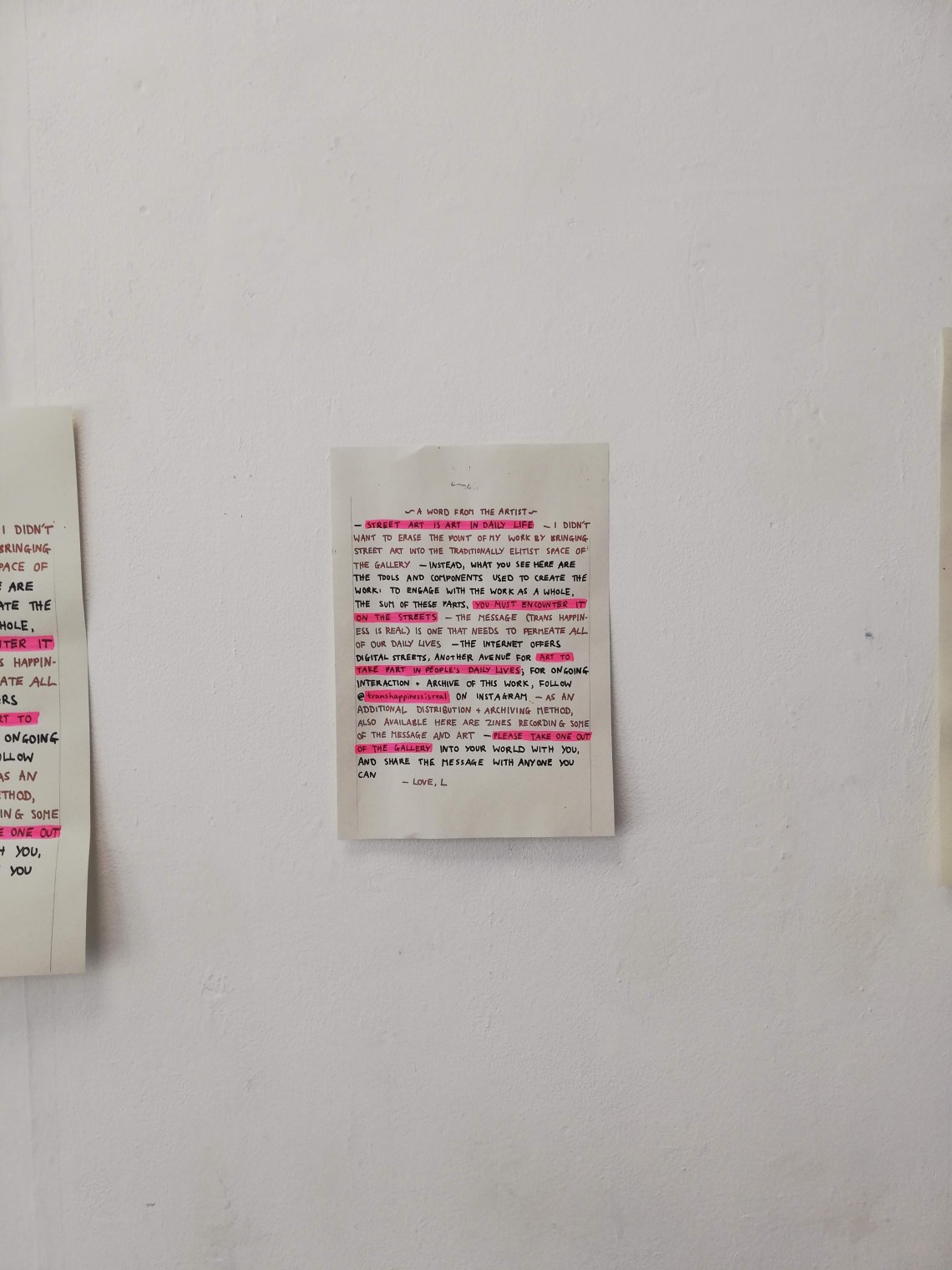
Also tried blowing it up to A3 on the photocopier, and incorporating highlighted sections, all of which improves it

A4, with highlighter: too small

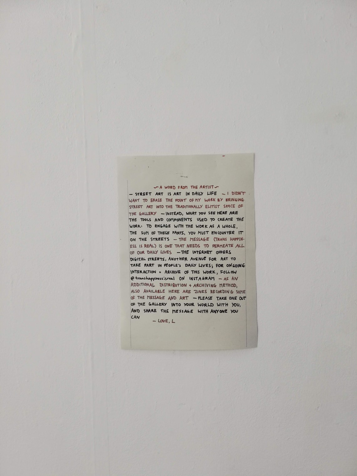
A3 plain: best lettering scale and size thus far, but not exciting enough now that I’ve seen some with highlighter

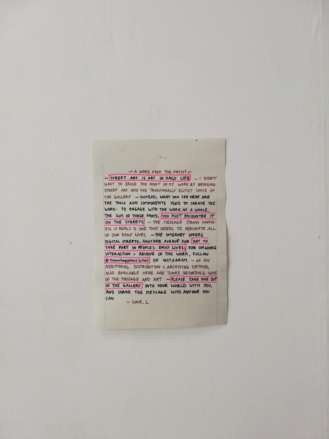
A3 with lined highlighting: like this, but think the lines disrupt the page? Make it a tad harder to read? Less effective at both highlighting specific phrases and at making the text readable as a consistent whole

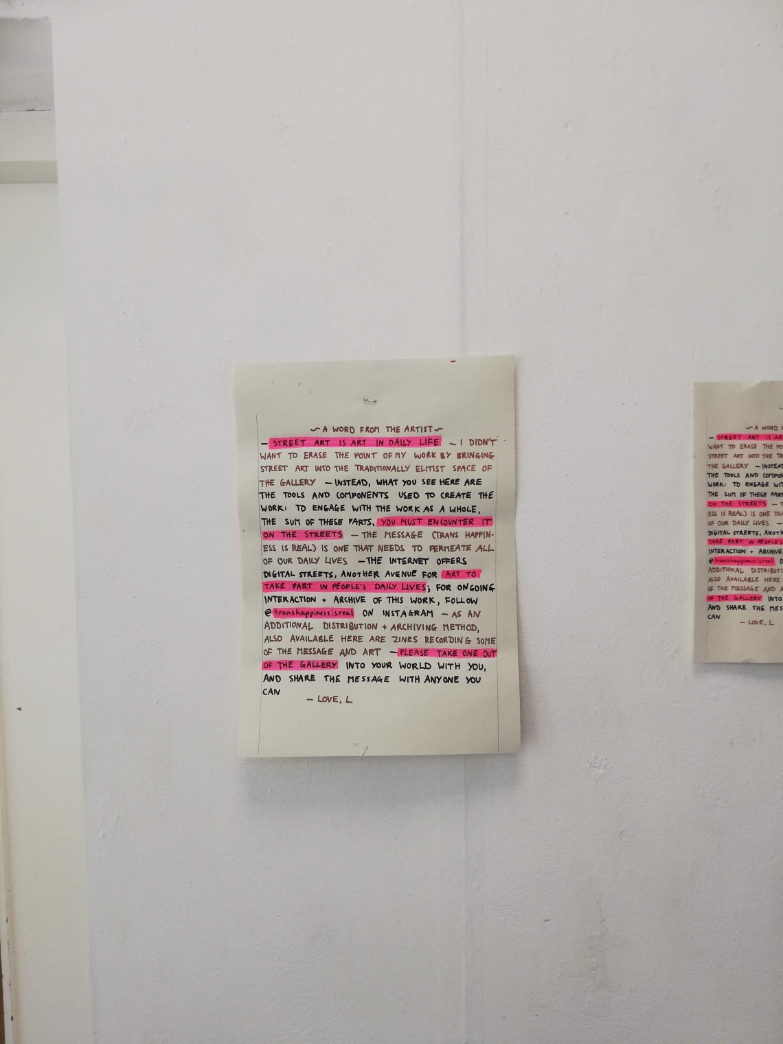
A3 with traditional highlighter: think this is the best (although still not good enough). Highlighting is effective, and use of both recycled paper and fluorescent pink connects the visual languages to the posters/the rest of the work. It’s just that as a single clean cut sheet it swims a bit on the wall, looks like an after thought. Not enough dedication to presence + distribution of message (nor to tactility, but not sure how to achieve this on the wall?)