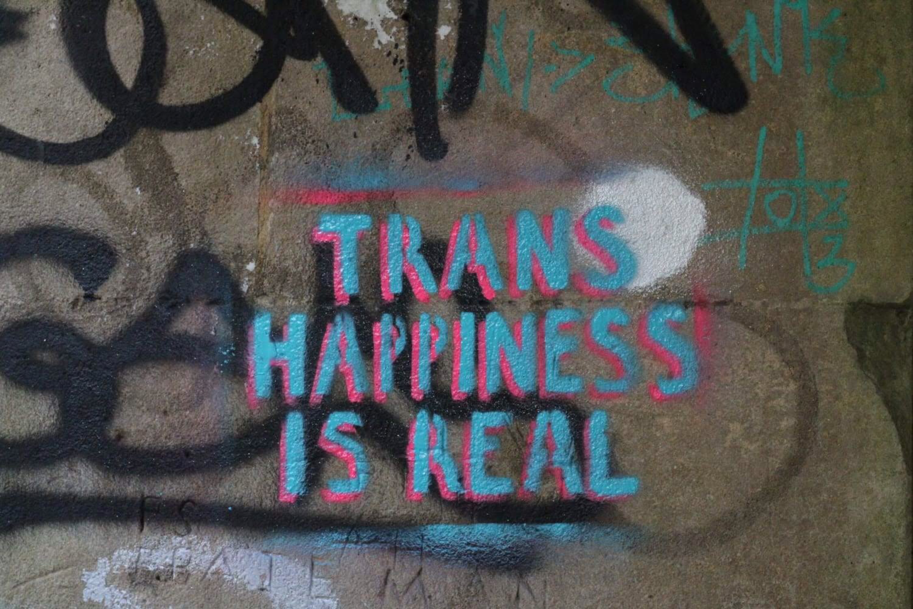
I was concerned that spray paint might be much less durable than wheat pasted posters, even though it claimed to be weatherproof and quick drying, as the two tests that I did one night on St Clements had already been removed by the following morning. But I went ahead with doing a bunch in town anyway to be sure,and at the time of writing they’ve been up for 3 days and are still looking bright and shiny. It must be the case that someone on St Clements doesn’t like graffiti and made the effort to take it down asap – I didn’t put up any posters on that street, so I can’t compare the staying power there.

Using spray paint also made it easy to do text in several layers in several colours to create shadows and to vary the order of the colours between individual pieces -whereas with the screen printing that took a lot more time, because you have to wash the colour out of the screen and let it dry before you use a new colour. (I suppose I could solve that by having multiple screens printed with the same text so I could use multiple colours at once, or by not caring if I get the colours mixed together a little – in which case no need to wash it out, but I can’t do that as long as I’m printing in the uni studio rather than my own).
After a while (a good hour or so) I had to start thinking about stopping, because my cardboard stencil was getting damp and bendy from having so many layers of acrylic sprayed on it without drying time inbetween, so I was a bit constrained by materials there. That also made it difficult to be accurate about how much shadow I was creating – how far apart the different colours of text were. As a result, some of the instances are more clearly legible than others. I think more practice at stencil cutting and straighter letters would also improve legibility, but I do have the issue of size, in that an increase in size could mean larger letters with more space between them (more legible and more room for shadow) but it would also make it harder to find places to put the message up: several spots don’t have room for something wider than A4 landscape.


Potential solution: two stencils? One still A4 for smaller spaces, but one larger for better legibility and to accommodate a more dramatic shadow (for use on larger spaces).
Some viewer feedback has included suggesting that I go into deep Cowley/Temple Cowley to do some as well as just central town, because there are apparently lots of issues with transphobia out that way (including, one of my coworkers has trans neighbours and they frequently get targeted with street harassment). I need to investigate 1) how I get out there at night when there are no buses and I can’t just walk there and 2) my own safety, because I don’t know the area, whereas I know town really well. But it’s a good suggestion and it deserves consideration, because this work is supposed to be about the people who need to see it.
Stickers!
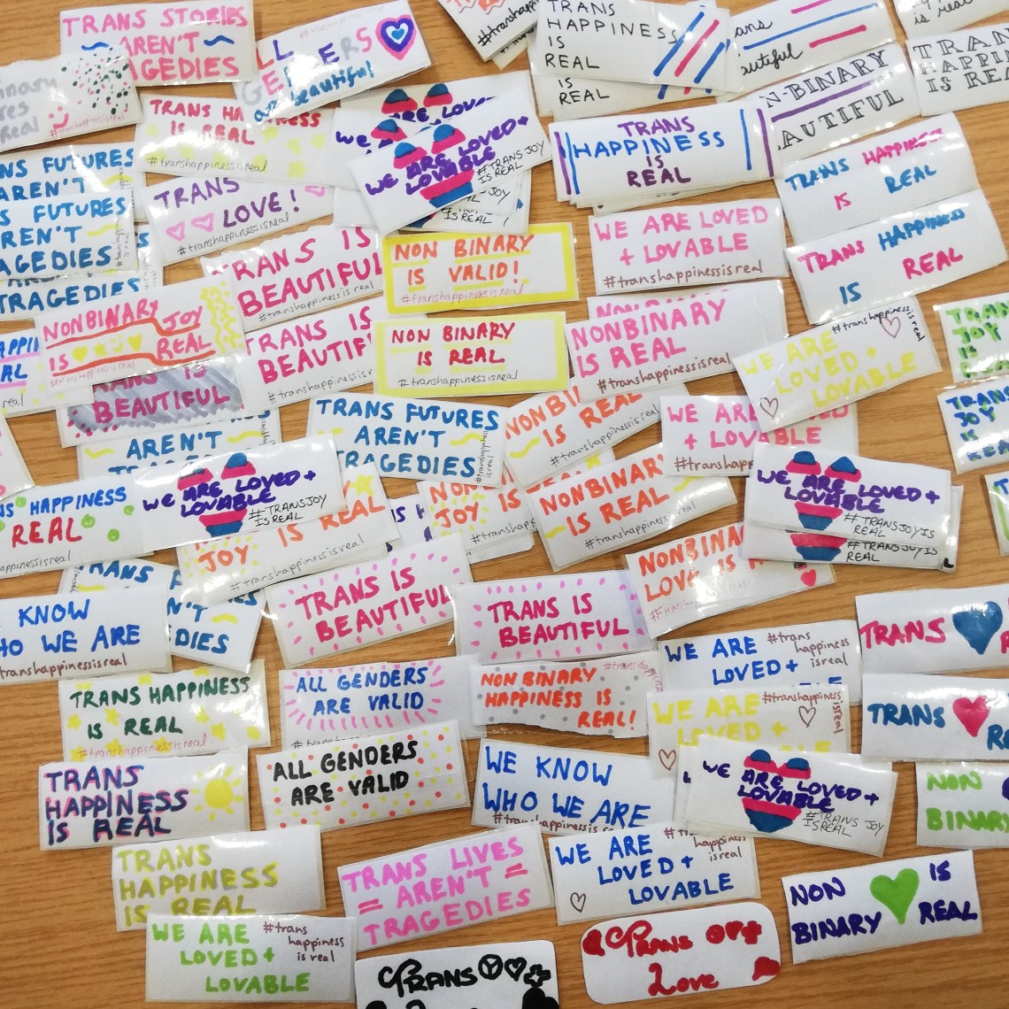
For trans day of visibility, I collaborated with OULGBTQ Soc and brought sticker making supplies and inspiration (photos of my previous round of stickers) to an event. People seemed very into it and happily spent the two hour gathering drawing away; we made a lot of stickers. Some people wanted to keep theirs but others gave them to me so that I could put them up round town n that. Obviously it’s good to involve others because we can make a lot more stickers in the same amount of time, but also I think having lots of different people’s voices and styles on the stickers really drives home the sense that the project is about the community, not just one man talking to himself. It also enforced that in a way, as I couldn’t over-plan all the stickers or control how they were done or where they are put up, I had to let other people’s input stand. And the variety is beautiful.

Possible questions:
- Keep the graphic language: postcards, get stickers made with images of the stencilled message make prints of the stencil, use the stencilled spray message as a kind of logo on the YouTube channel?
- Scan in some stickers so I could get some digitally made in the handwritten style
- Graffiti in Temple Cowley
- Larger stencil?
- Does fabric spray paint exist? Could I make shirts and bags with a stencil?
Follow up
Fabric spray paint does exist, but it is usually fabric dye, so you can’t spray a light colour over a dark fabric. Screen printing (where I was able to use opaque binder to use yellow dye on navy fabric) still has the edge there then.
