
Handcut with a craft knife out of A4 cardboard. Need to try a new material, maybe a new method, new size, possibly new typography.
Double Shadow
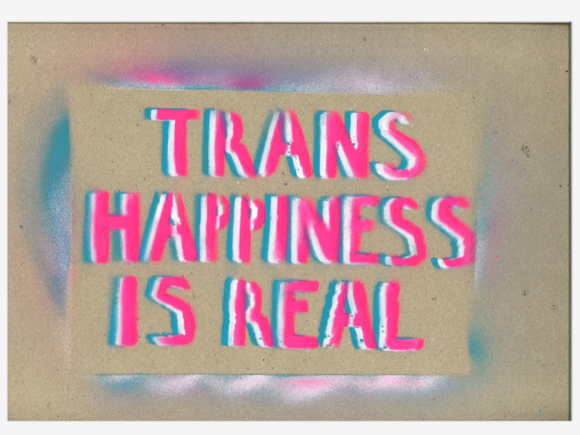
3 layers in different colours, at roughly the same indent each time, and all layers opaque. The top layer is primarily the legible one, and the 2 behind provide colour contrast and interest. If I get the layers too far apart, or the top layer not opaque enough, it can become too difficult to read. A very strong colour contrast (eg close blue and pink on a dark background) can also interfere with legibility as it makes people’s eyes hurt, although it’s very striking.
Does have the advantage that having a backing colour in a contrasting colour can make the top colour (espec light colours like pink) much easier to see.
One Shadow


One shadow, at a wonky angle, and the top layer not thoroughly opaque. Relies mostly on the base layer for legibility, and the top layer adds interest and colour – the eye catching element. Can become difficult to read if the top layer is too opaque or wonky in a weird way – which is hard to predict.
Stripes
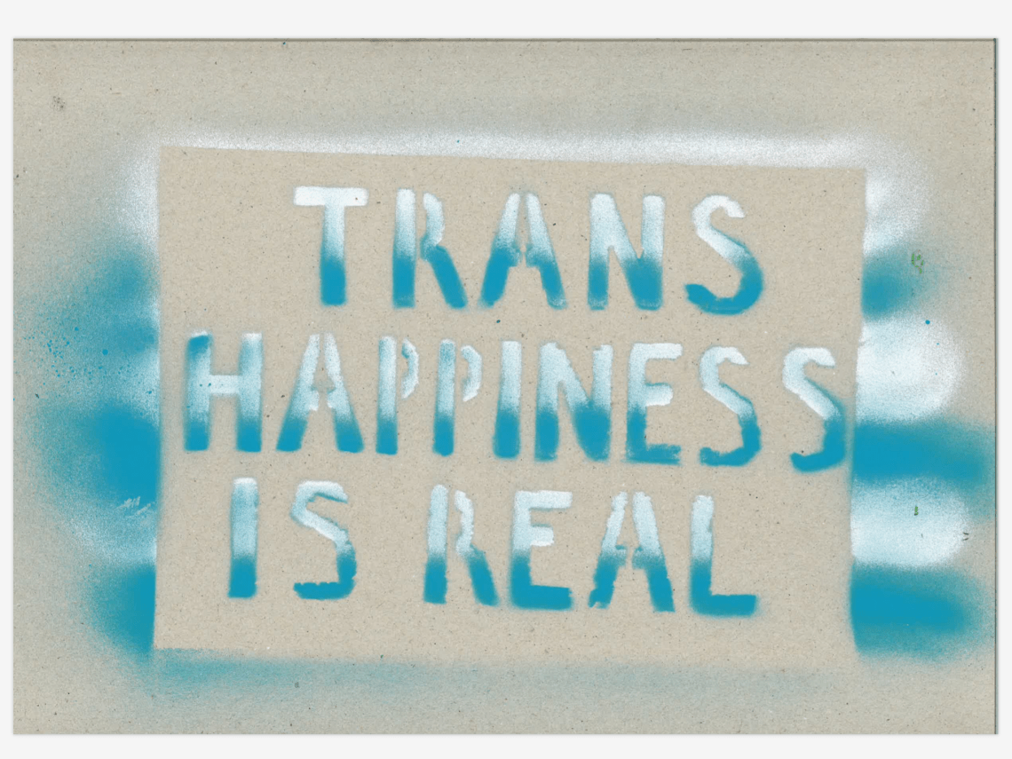
Mimics the stripes on the flag potentially, if I did it with the 3 colours.
Allows for adding more colours for interest and eye-catchingness, but without introducing a shadow that can complicate legibility. Haven’t tried this in irl graffiti yet so I need to give it a shot.
Gives the letters an appealing dynamic energy, draws the eye vertically.
Spot Highlights
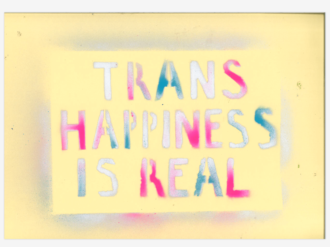
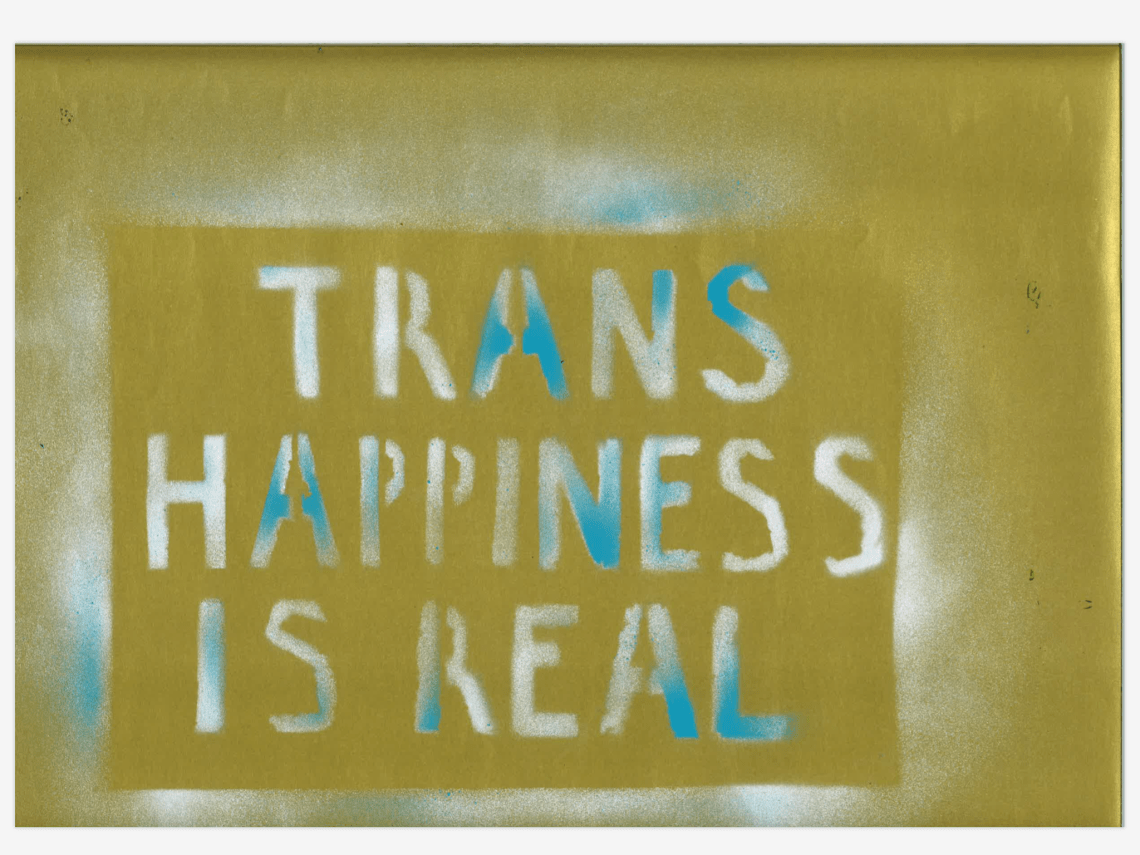
Another way of introducing more colours without adding a shadow. Also a way of stretching the use of the bright colours when they start to run out: using them only in patches means I use less of them on each sign so they can add interest to more signs overall.
Interesting potential to highlight specific parts of the words: need to consider what Louise said about the ‘is’ being the emphasized part in her eyes.
Stripes and spots
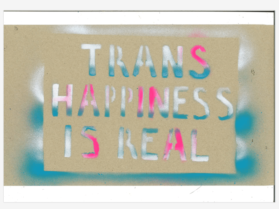
Maybe too much, too complicated? Combination of the two features seems to reduce the dynamic energy of the stripes. Even though it does achieve combining the 3 colours without a shadow, and preserves legibility.
3 colours, no shadow
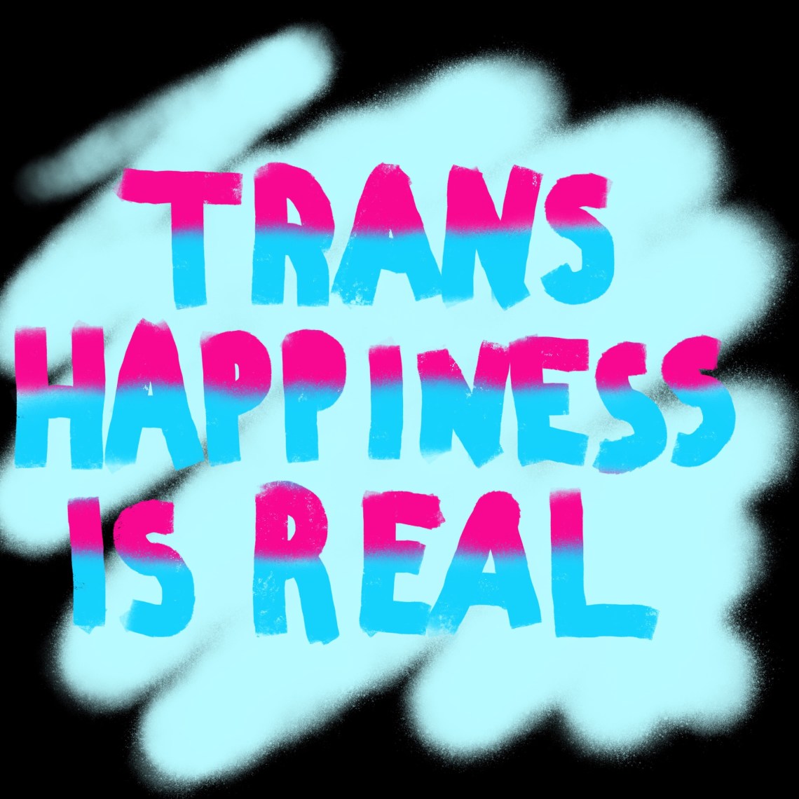
An idea I just had of how to combine 3 colours without the above compromise: use one as the background.
- Uses three colours
- Doesn’t use a shadow which is unpredictable and can affect legibility
- Keeps the dynamism of the stripes
Need to test it irl
