Plastic stencil
- Easier to plot design – you can see the cutting mat and measurements grid through it; makes for a more precise and consistent typography
- Much easier to cut than the thick cardboard; also makes for a neater typography
- Too flexible: couldn’t be held up with one hand while spraying with another; tape didn’t stick well because the outside surfaces are typically dusty and dirty. I either need an accomplice to hold the stencil, or something to stiffen the edges so I could hold it by the top with one hand and the edges wouldn’t curl up – tape rulers on?
- Ideal material would be (semi)transparent, not too hard to cut, but stiff even on a large scale

Had an idea: spray the design onto some kind of Matt but transparent material, so that I can tack it onto buildings and take photos as if it’s been sprayed there, but without tempting arrest by actually spraying it on. Would allow for photographic evidence that would suggest my message on iconic buildings (rad cam etc).


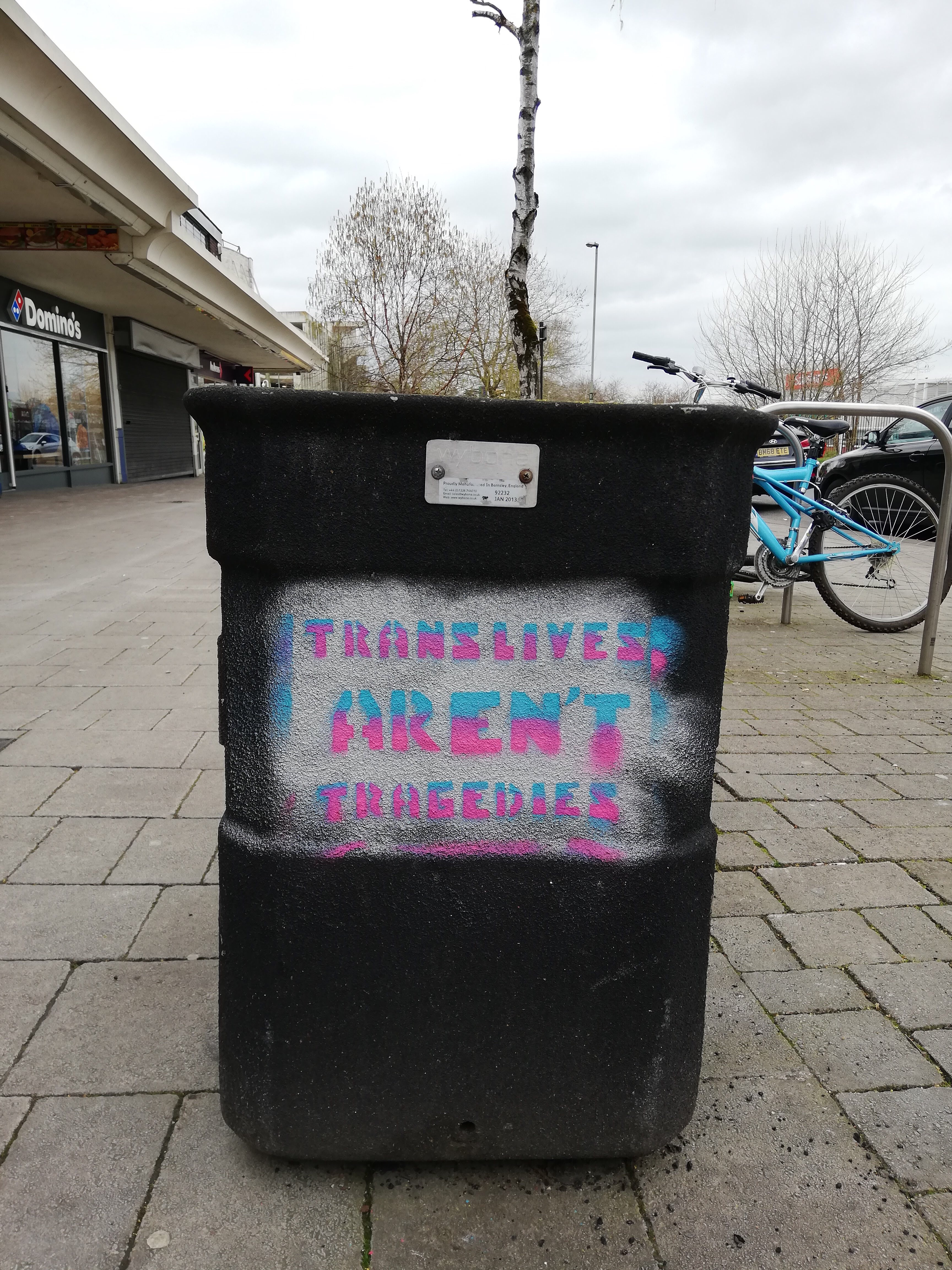
Saw some large scale serious street art while out in Temple Cowley, and that really drove home the impact of art on the street, that’s up close and personal with the people, present in daily life, you can touch it if you want. It doesn’t get any more accessible than that?
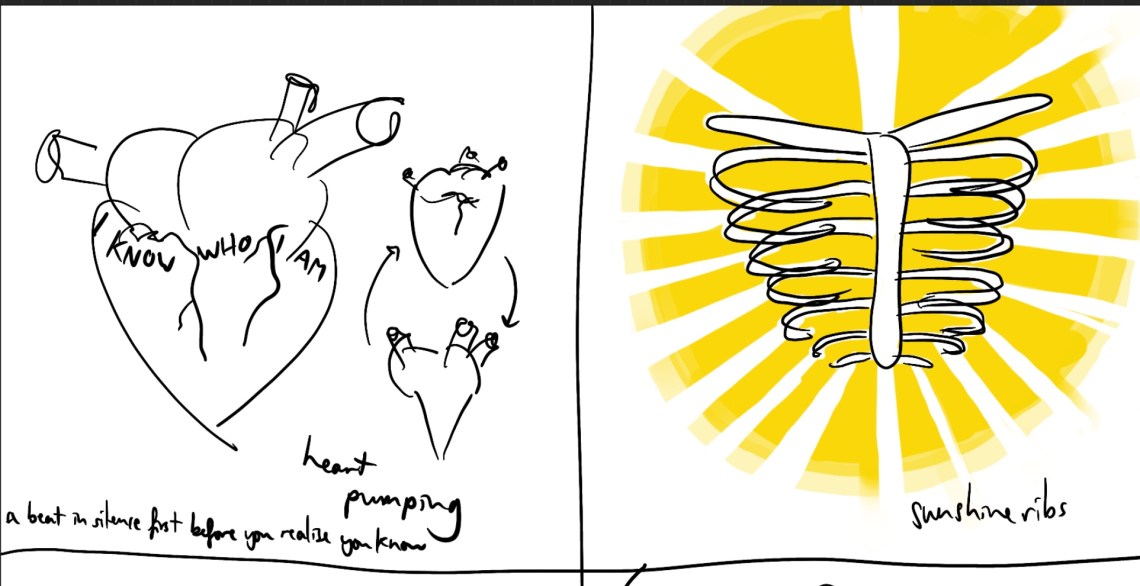
When I went back in the daytime, somebody was making a new piece, in the day – it must not be illegal. How does one go about getting one of these wall spaces to make large scale art on? Are there permits? Applications? Do I have anything that I would want to make on that scale? Possibly some of the visualizations from my self-portrait-spring-19 idea:
Need to research more actual street art, not just stencils and posters.
Styles eval
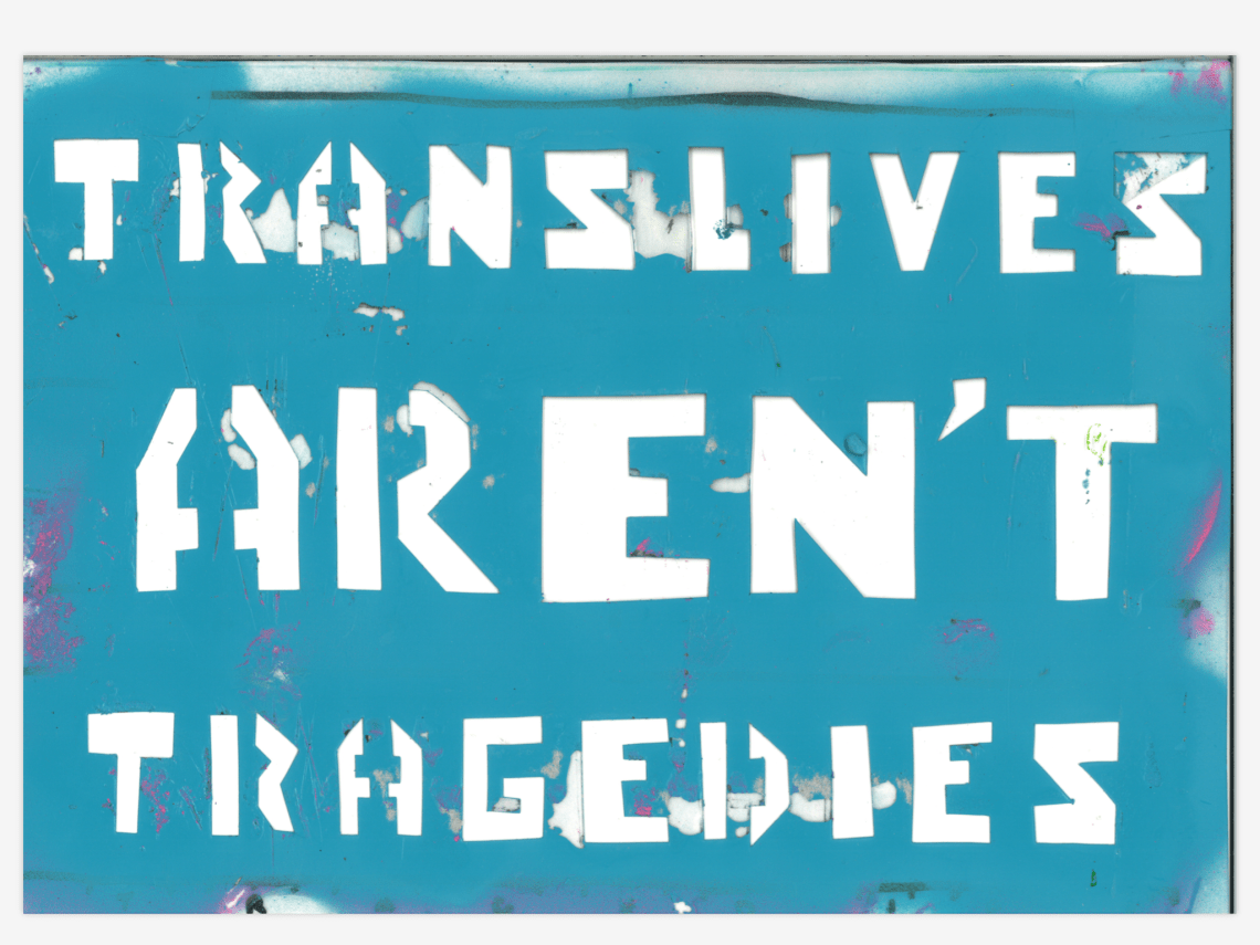
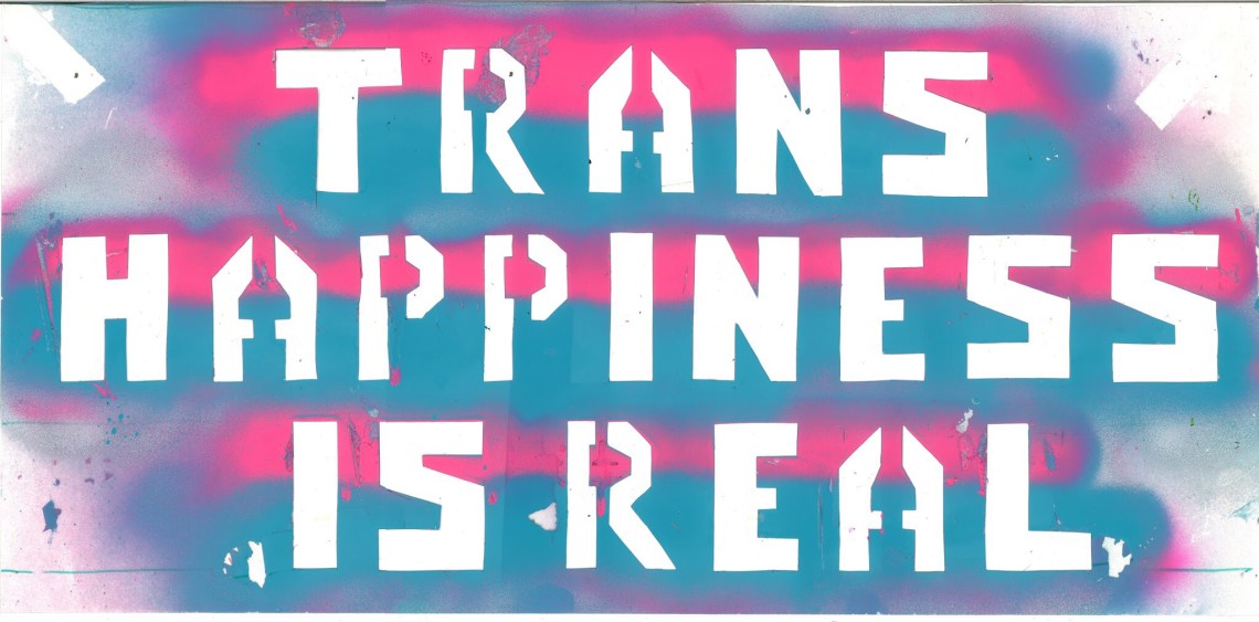
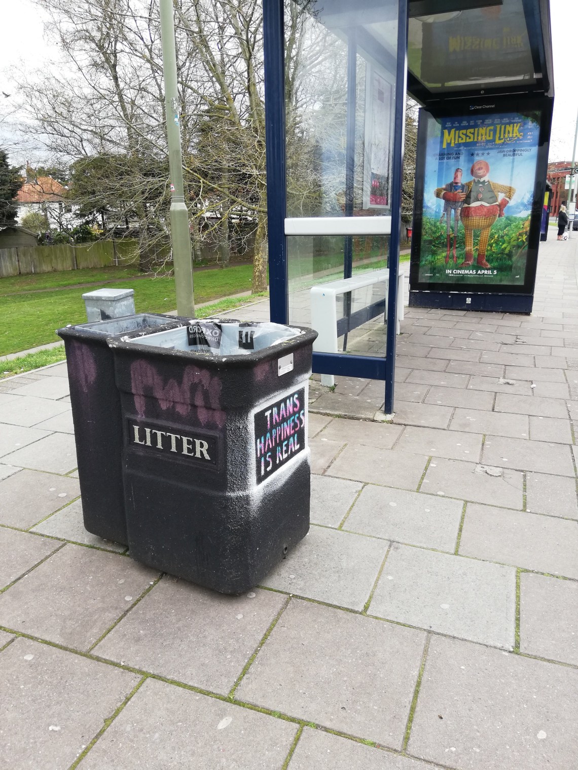
The idea of the stripe in the letters over a coloured background (that I mentioned in the last styles eval) was indeed very effective:

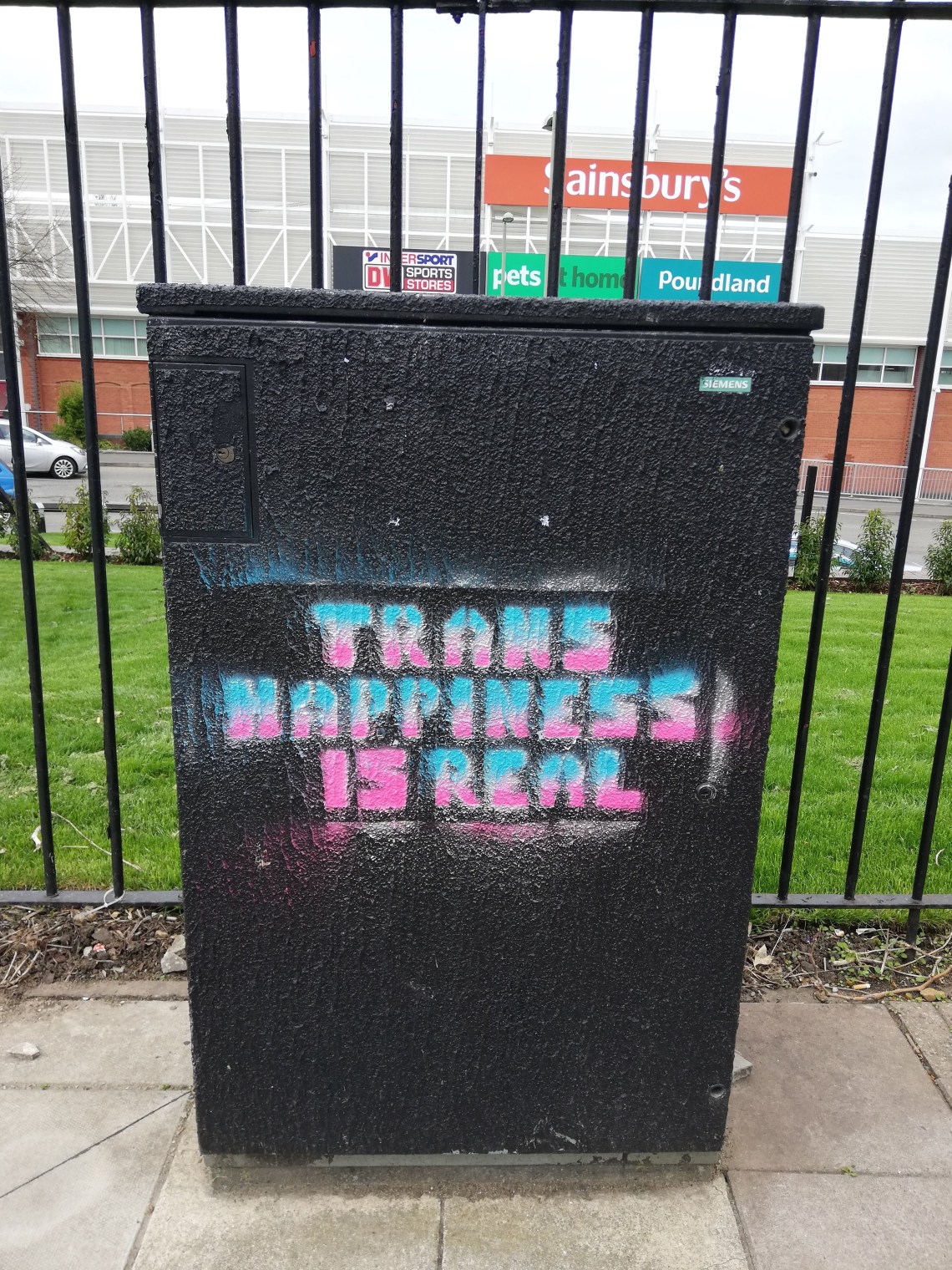
Triple stripe (^) with all 3 flag colours was also pretty effective and dynamic, although there are some legibility issues – from the fact that the large plastic stencil kept trying to curl up and move around. Here I also tried emphasizing the ‘is’ with colour; I haven’t decided yet whether I like it or not.
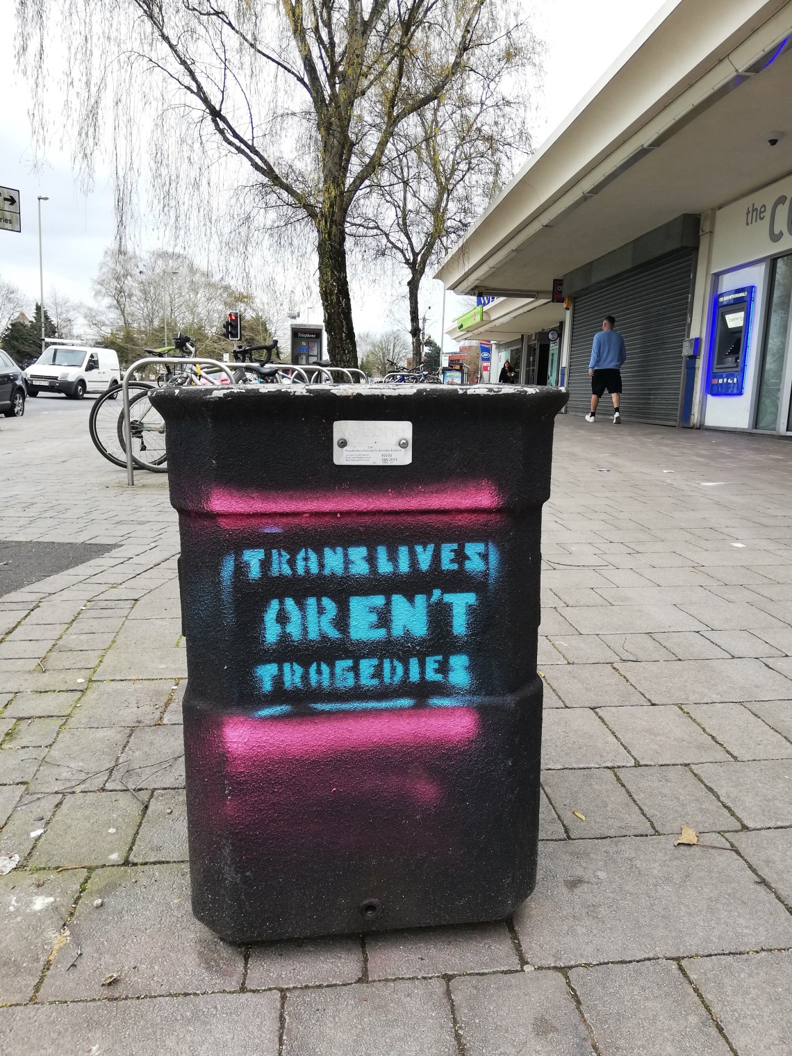
In the above photo, I tried adding some freehand stripes just to add another colour and try to make it eyecatching. Quick and simple and effective for what it is. Not as appealing or dynamic as the versions with the colours mixed within the lettering.
I also tried adding an outline around the outer edge of the stencil, and I think this is a good technique for impact and drawing the eye. Could possibly have been neater with the outer edge, but I don’t think it’s too serious, and also will improve with more practice using the spray paint freehand still.
^Just to note how clearly it’s the case that if I want to be impactful in a larger context I will need to work much larger; it doesn’t matter how bright the colours are or strong the typography otherwise.

1 Comment